


Hi, I’m Hadith. I design with pixels and purpose.
From idea to interface, I turn concepts into clean, human-centered products.
AI-Powered Calorie Counter App
UX/UI Design · Product Thinking · Development
Problem
Short-form visual content often focuses on quick impact rather than intentional design. This makes it difficult to find visuals that balance motion, color, and rhythm in a way that feels calm, cohesive, and aesthetically structured.
Too many steps to log a single meal Overloaded dashboards that feel noisy and stressful
Too many steps to log a single meal Overloaded dashboards that feel noisy and stressful
Users often quit after a few days of inconsistent logging
Users often quit after a few days of inconsistent logging
The design challenge was to create an experience that is fast, supportive, and realistic to maintain.
The design challenge was to create an experience that is fast, supportive, and realistic to maintain.
Approach
UX Research & Strategy
I did a light competitive review and spoke with a few people who had tried calorie tracking and stopped. The key insights:
People want awareness, not perfection.
People want awareness, not perfection.
They prefer “good enough” estimates over time-consuming precision.
They prefer “good enough” estimates over time-consuming precision.
Guilt-based language and complex screens reduce long-term engagement.
Guilt-based language and complex screens reduce long-term engagement.
Experience Design
I structured the app around a simple information architecture:
Home: Today’s calories & quick “Log meal” entry
Home: Today’s calories & quick “Log meal” entry
Log: Chat-like list of meals for the day
Log: Chat-like list of meals for the day
History: Previous days and trends
History: Previous days and trends
Profile: Goals and preferences
Profile: Goals and preferences
Algorithmic Visual Experience:
CodeChaosStudio
Motion Design · Visual Computing · UX for Sensory Engagement
Overview
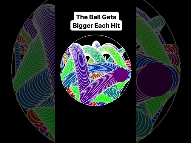
CodeChaosStudio is a series of short, algorithmically generated visual simulations designed in Python and published on YouTube Shorts. The project explores how minimal computational visuals can support user relaxation, attention reset, and sensory satisfaction through rhythm, motion, and color. This work falls under experience design: shaping how users feel and respond to visual stimuli. The project demonstrates the intersection of programming, visual psychology, and UX thinking.
Problem
Short-form visual content often focuses on quick impact rather than intentional design. This makes it difficult to find visuals that balance motion, color, and rhythm in a way that feels calm, cohesive, and aesthetically structured. There is a need for algorithmic visuals that prioritize:
Clear and readable motion
Clear and readable motion
Purposeful color choices
Purposeful color choices
Viewer comfort
Viewer comfort
Approach
The project was developed through a series of controlled visual experiments created in Python. The focus was on designing motion systems that feel coherent and intentional rather than random. This involved:
Building physics-based and mathematical motion patterns
Building physics-based and mathematical motion patterns
Testing rhythm consistency, and loop smoothness
Testing rhythm consistency, and loop smoothness
Exploring color palettes that support visual harmony
Exploring color palettes that support visual harmony
Outcome
The result is a collection of algorithmic visual pieces published under CodeChaosStudio, each designed to deliver a calm and visually structured experience. The series establishes a consistent visual identity across color, motion, and framing, making the content recognizable and thematically unified. Early viewer responses indicate strong engagement with the smooth motion patterns and gradient-based aesthetics, suggesting that intentional design principles translate effectively even within short-form video constraints. The project demonstrates how computational methods, motion design, and UX considerations can work together to shape sensory-focused visual experiences.
AI-Powered Calorie Counter App
UX/UI Design · Product Thinking · Development
Problem
Short-form visual content often focuses on quick impact rather than intentional design. This makes it difficult to find visuals that balance motion, color, and rhythm in a way that feels calm, cohesive, and aesthetically structured.
Too many steps to log a single meal Overloaded dashboards that feel noisy and stressful
Too many steps to log a single meal Overloaded dashboards that feel noisy and stressful
Users often quit after a few days of inconsistent logging
Users often quit after a few days of inconsistent logging
The design challenge was to create an experience that is fast, supportive, and realistic to maintain.
The design challenge was to create an experience that is fast, supportive, and realistic to maintain.
Approach
UX Research & Strategy
I did a light competitive review and spoke with a few people who had tried calorie tracking and stopped. The key insights:
People want awareness, not perfection.
People want awareness, not perfection.
They prefer “good enough” estimates over time-consuming precision.
They prefer “good enough” estimates over time-consuming precision.
Guilt-based language and complex screens reduce long-term engagement.
Guilt-based language and complex screens reduce long-term engagement.
Experience Design
I structured the app around a simple information architecture:
Home: Today’s calories & quick “Log meal” entry
Home: Today’s calories & quick “Log meal” entry
Log: Chat-like list of meals for the day
Log: Chat-like list of meals for the day
History: Previous days and trends
History: Previous days and trends
Profile: Goals and preferences
Profile: Goals and preferences
Problem
Short-form visual content often focuses on quick impact rather than intentional design. This makes it difficult to find visuals that balance motion, color, and rhythm in a way that feels calm, cohesive, and aesthetically structured.
Too many steps to log a single meal Overloaded dashboards that feel noisy and stressful
Users often quit after a few days of inconsistent logging
The design challenge was to create an experience that is fast, supportive, and realistic to maintain.
Approach
UX Research & Strategy
I did a light competitive review and spoke with a few people who had tried calorie tracking and stopped. The key insights:
People want awareness, not perfection.
They prefer “good enough” estimates over time-consuming precision.
Guilt-based language and complex screens reduce long-term engagement.
Experience Design
I structured the app around a simple information architecture:
Home: Today’s calories & quick “Log meal” entry
Log: Chat-like list of meals for the day
History: Previous days and trends
Profile: Goals and preferences
Algorithmic Visual Experience: CodeChaosStudio
Motion Design · Visual Computing · UX for Sensory Engagement
Overview
CodeChaosStudio is a series of short, algorithmically generated visual simulations designed in Python and published on YouTube Shorts. The project explores how minimal computational visuals can support user relaxation, attention reset, and sensory satisfaction through rhythm, motion, and color. This work falls under experience design: shaping how users feel and respond to visual stimuli. The project demonstrates the intersection of programming, visual psychology, and UX thinking.
Problem
Short-form visual content often focuses on quick impact rather than intentional design. This makes it difficult to find visuals that balance motion, color, and rhythm in a way that feels calm, cohesive, and aesthetically structured. There is a need for algorithmic visuals that prioritize:
Clear and readable motion
Purposeful color choices
Viewer comfort
Approach
The project was developed through a series of controlled visual experiments created in Python. The focus was on designing motion systems that feel coherent and intentional rather than random. This involved:
Building physics-based and mathematical motion patterns
Testing rhythm consistency, and loop smoothness
Exploring color palettes that support visual harmony
Overview
CodeChaosStudio is a series of short, algorithmically generated visual simulations designed in Python and published on YouTube Shorts. The project explores how minimal computational visuals can support user relaxation, attention reset, and sensory satisfaction through rhythm, motion, and color. This work falls under experience design: shaping how users feel and respond to visual stimuli. The project demonstrates the intersection of programming, visual psychology, and UX thinking.
Problem
Short-form visual content often focuses on quick impact rather than intentional design. This makes it difficult to find visuals that balance motion, color, and rhythm in a way that feels calm, cohesive, and aesthetically structured. There is a need for algorithmic visuals that prioritize:
Clear and readable motion
Clear and readable motion
Purposeful color choices
Purposeful color choices
Viewer comfort
Viewer comfort
Approach
The project was developed through a series of controlled visual experiments created in Python. The focus was on designing motion systems that feel coherent and intentional rather than random. This involved:
Building physics-based and mathematical motion patterns
Building physics-based and mathematical motion patterns
Testing rhythm consistency, and loop smoothness
Testing rhythm consistency, and loop smoothness
Exploring color palettes that support visual harmony
Exploring color palettes that support visual harmony
Outcome
The result is a collection of algorithmic visual pieces published under CodeChaosStudio, each designed to deliver a calm and visually structured experience. The series establishes a consistent visual identity across color, motion, and framing, making the content recognizable and thematically unified. Early viewer responses indicate strong engagement with the smooth motion patterns and gradient-based aesthetics, suggesting that intentional design principles translate effectively even within short-form video constraints. The project demonstrates how computational methods, motion design, and UX considerations can work together to shape sensory-focused visual experiences.